Art direction
A style label is not an art direction
Turn a visual reference into a small recipe, compare a courier, doorway and panel, and keep failures that reveal what the recipe leaves open.
No firsthand experiment reported
Published
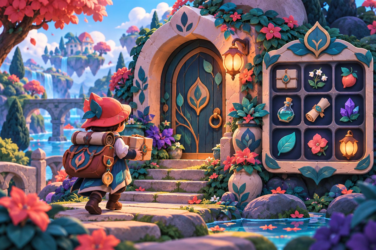
Proposed art-direction exercise
One recipe, three objects
Reference
Compare the courier, doorway and panel together. Look for the shapes and visual motifs that make the three belong to the same game.
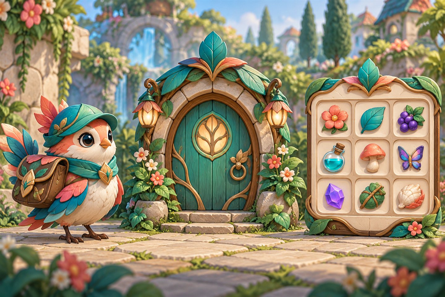
Recipe
- Shape
- Rounded arches and uneven curves.
- Line
- Dark brown contours, thinner interior marks.
- Palette
- Cream, leaf, earth, amber.
- Detail
- Ornament at the edges, breathing room for text.
Variations
Try one change at a time. Simplify the door’s interior marks, compare the courier against light and dark scenery, or move ornament away from the panel labels. Judge each result at play size.
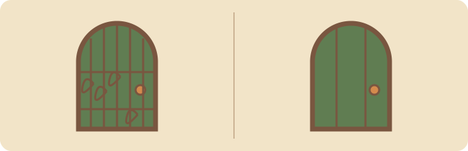
Start with a small art-direction card, then judge the assets together at their intended display size. A style name can help you find references; it cannot settle every choice about shape, line, palette or readability. The practical goal is a set of decisions you can point to when a character looks at home but its inventory screen does not.
This is an original proposed exercise for a small illustrated garden game. We have not generated its assets or tested whether a model follows the card. It helps decide what to ask for and reject, rather than promising consistent results from a particular generator.
Worth trying: write a card that lets another person explain why one result fails. A card becomes a production aid when its decisions survive an unfamiliar subject and a real display context.
What we know / don't: source traits were rechecked November 1, 2026. The garden card, dimensions, palette and comparison method are editorial proposals. No prompt reliability, cross-model performance, reader outcome or game-runtime result has been measured.
Write decisions someone else can follow.
Read the proposed art-direction card
Write the decisions before the assets
The decorative-storybook atlas entry connects references, visible traits and a global direction prompt. Treat it as a starting reference, then make decisions for your own game. The card below is our proposal, not a copy of a game's art bible.
Context: a fixed three-quarter camera, a courier about 96 pixels tall in play, and an inventory beside the world. These are exercise assumptions; choose different values if your camera or platform needs them.
Shape: build the courier's bag, door arch and panel corners from rounded, slightly uneven curves. Keep one large readable silhouette per object. Avoid introducing sharp mechanical frames only in the UI.
Line: use one dark brown contour family. Begin with a two-pixel outer contour at play size and a thinner interior treatment; inspect the result before fixing that rule. A line that vanishes on the doorway is a failed rule even if it looks delicate in a large illustration.
Palette and values: start with cream #F2E4C8, leaf #607D52, earth #795640 and accent #D48A4D. Reserve the accent for the object or action requiring attention. Check the courier against both light and dark scenery. These colors are an original working choice, not a tested accessibility palette.
Detail and UI: collect ornament around edges and leave a quiet area behind text. Reuse a leaf-shaped curl on the bag clasp, doorway sign and panel frame. Judge text and selection states at the actual UI scale, separately from whether the ornament is attractive.
Wrong for this card: a glossy plastic courier, a heavily shaded realistic door or a panel whose ornament competes with item names. A rejection should name the broken rule and suggest one repair.
Judge the courier, doorway and interface together.
Read how to compare the asset set
Compare one small set
Make the courier, doorway and inventory panel using the same card. Record the generator or artist, tool version, input references, output size and manual changes. Place the three in one mock scene at play size. This exercise needs no particular tool; generating it is a later activity.
Look at silhouettes and camera angle, then contours, values and detail. If the courier is clear alone but disappears against plants, the set fails its intended use. If the panel looks pasted in, compare its curves and edge contrast with the doorway before adding decoration.
Write one correction: for example, reduce the doorway's interior marks while keeping its silhouette. Change only that decision, compare again and count correction time. Save the discarded version so the reason for the rule remains inspectable.
A new subject reveals gaps in the recipe.
Read how to test another subject
Ask for another subject
Try a watering can without silently changing the card. A successful first set could reflect a lucky output or familiar subject. A new subject may reveal that the card never specified metal, highlights or tiny icons. Add a versioned material rule if needed and retain both outcomes.
Drift can come from vague direction, a tool limitation or inconsistent manual cleanup. The comparison alone cannot tell you which. Keep those explanations open instead of declaring the recipe reliable after one attractive image.
Credit references; create original designs.
Read about reference rights
Keep reference and reuse separate
A public reference gallery does not grant permission to extract its game art. The atlas identifies rights holders and does not confirm a general image republication license. Use original designs and compositions; link references rather than copying screenshots into the article or asset set.